The Color Psychology of Fall: Why Orange and Red Make Us Feel at Home
La-Z-Boy Southeast | September 26, 2025
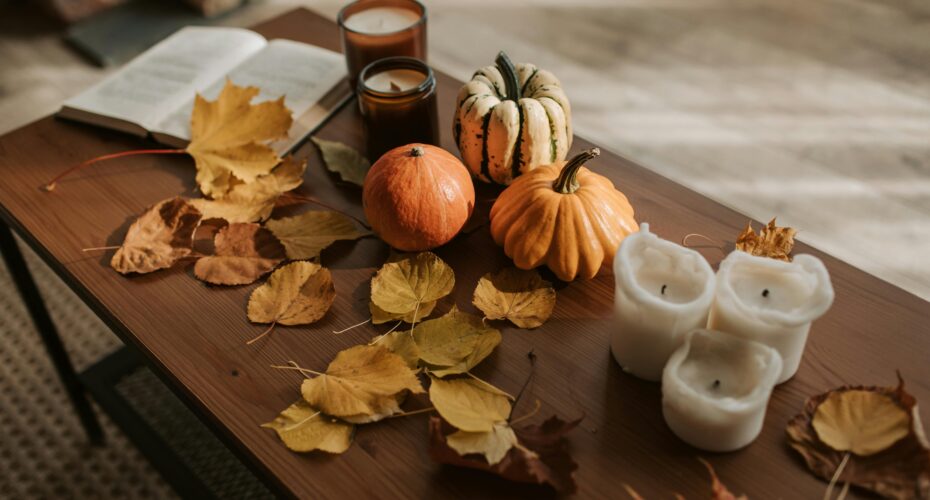
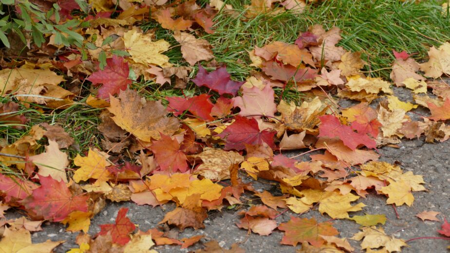
Every autumn, nature transforms into the world’s most effective interior designer. The landscape paints itself in warm oranges, deep reds, and golden yellows. But there’s more than beauty at work here.
These colors trigger profound psychological responses. They explain why fall décor feels so irresistibly cozy. They also show us why we’re drawn to create warm, inviting spaces as seasons change.
The Warmth Factor: Why Orange Dominates Fall Color Psychology
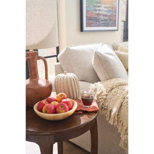
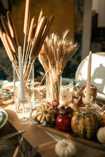
Orange sits at the intersection of energizing red and cheerful yellow. Psychologists call it a “social color.” Research shows orange stimulates appetite, conversation, and feelings of enthusiasm.
This makes orange perfect for the season of harvest gatherings and holiday preparations. It explains why pumpkin spice everything feels so appealing. We’re not just tasting fall—we’re absorbing its psychological warmth.
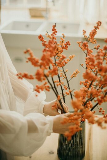
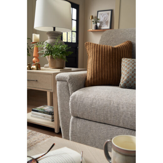
In your living space, orange accents create “psychological warming.” Your brain perceives the room as physically warmer. The thermostat hasn’t changed, but orange throw pillows, blankets, and seasonal décor make the difference.
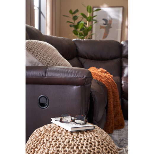
Red: The Connection Color in Fall Color Psychology
Deep autumn reds tap into our most primal color associations. Colors like burgundy leaves and cranberry accents increase heart rate slightly. They create feelings of intimacy and closeness.
This is why red dining rooms have been popular for centuries. Adding red elements to your fall décor makes spaces feel more welcoming for gatherings.
Darker reds produce different effects than bright reds. Wine, maroon, and deep crimson create “cocooning” effects. These autumn shades make large spaces feel more intimate. They encourage longer, more relaxed conversations.
Golden Yellow: The Mood Elevator in Fall Color Psychology
Fall’s golden tones aren’t just beautiful—they’re therapeutic. Yellow stimulates serotonin production. It has been shown to reduce symptoms of seasonal depression.
As natural sunlight decreases, incorporating golden yellows helps maintain psychological brightness. Use warm lighting, golden textiles, or wall accents to harness this effect.
This explains why we love golden hour lighting in fall photography. It translates beautifully to interior spaces through warm LED bulbs and golden-toned lampshades.
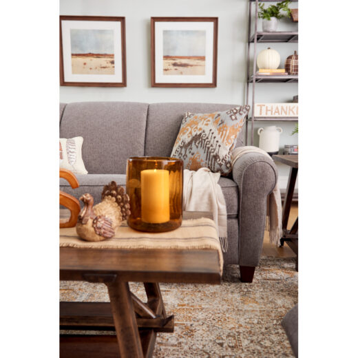
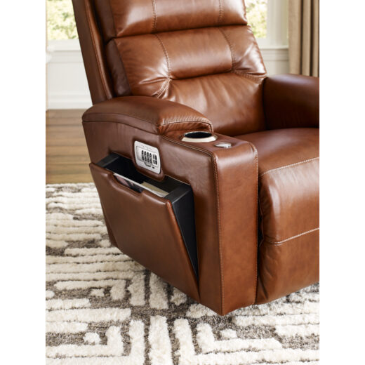
Brown: The Grounding Force in Fall Color Psychology
Brown is fall’s psychological anchor. Earth tones create feelings of stability, reliability, and being grounded. This is exactly what we crave as we transition from summer’s spontaneity to winter’s introspection.
Rich browns in furniture provide “psychological weight.” Leather recliners and wooden accents make spaces feel substantial and secure.
The Science Behind Seasonal Fall Color Psychology
Our color preferences actually change with the seasons. This happens due to evolutionary psychology. In fall, we’re unconsciously preparing for winter’s challenges.
We’re drawn to colors that signal warmth and food security (harvest colors). We also gravitate toward colors that promote social bonding (reds and oranges). This isn’t just preference—it’s survival instinct expressed through interior design.
Creating the Perfect Fall Color Psychology Palette
The 60-30-10 Rule for Fall:
60%: Warm neutrals (cream, warm beige, soft brown) for walls and large furniture
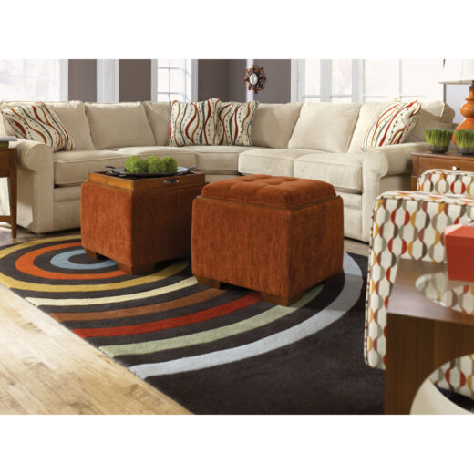
30%: Medium-intensity fall colors (rust orange, deep gold, wine red) for upholstery and curtains
10%: Vibrant accents (bright orange pillows, red throws, golden candles) for seasonal flexibility
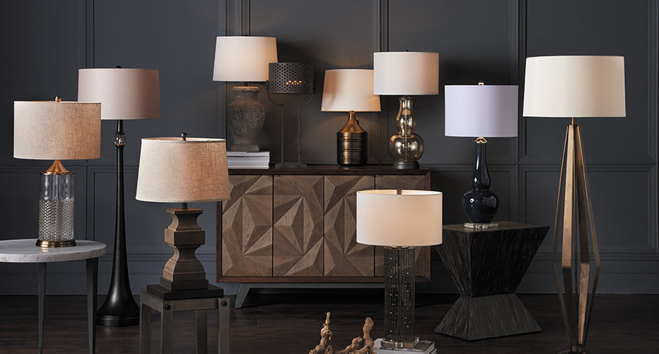
Lighting Enhances Fall Color Psychology
Color psychology intensifies under warm lighting. Cool fluorescent bulbs make even perfect fall colors feel harsh. Warm LED lighting (2700K-3000K) enhances the psychological effects of autumn hues.
The Comfort Connection in Fall Color Psychology
There’s a reason we associate fall colors with comfort foods and cozy sweaters. These colors literally lower our stress response. They encourage “restoration behaviors”—activities that help us recharge.
Understanding fall color psychology helps you create spaces that feel emotionally supportive. When you sink into a warm-toned recliner surrounded by thoughtful fall colors, you’re giving your brain exactly the environmental cues it needs to unwind.
Beyond Decoration: Living Fall Color Psychology
Fall’s color palette is a masterclass in environmental psychology. By understanding why these colors affect us so powerfully, you can create living spaces that actively support your wellbeing.
Your home can celebrate the season while supporting you through shorter, cooler days ahead. Fall color psychology isn’t just about decoration—it’s about creating spaces that make you feel genuinely at home.
Bring Fall Color Psychology to Your Home
Ready to transform your space with the power of fall color psychology? Visit any of our locations to meet with one of our degreed interior designers. Our design experts understand how colors affect mood and comfort, and they’ll help you create a personalized fall palette that makes your home feel perfectly cozy.
Whether you’re looking to add warm accent pieces or completely reimagine your space for the season, our professional designers will guide you through color choices that enhance both beauty and wellbeing. Schedule your complimentary design consultation today and discover how the right colors can make your house feel like the ultimate autumn retreat.